

Get Clients Online
The 9 Biggest Web Design Mistakes That Will Lose You Clients
Ever been impressed with someone when you meet face to face, see them speak, or talk over the phone; only to visit their website and feel let down by their online presence?
Wonder if that might be happening when people first visit your site? It probably is if you're making some of these big web design mistakes.
Your website is the hub of your online marketing activity, and it's your clients' window in to your world. An effective “Client Winning Website” can have a big impact on your ability to attract and win clients. A bad one can put them off completely.
 And it's not just the obvious things that can hurt you. Some of the most beautiful, professional looking websites can have huge problems when it comes to their effectiveness at getting you clients.
In this post we're going take a look at what, right now, are the biggest problems with most professional service websites and more importantly, what you can do to fix them.
But a couple of health warnings before we start.
Firstly, there are always exceptions to every rule. I'm going to give you general guidelines that work for most sites. But no doubt there will be sites that make many of these mistakes and succeed anyway. That doesn't mean you should try to emulate them. Avoiding these 9 mistakes will maximise your chances of success.
Secondly, I promise you that I make at least a few of these mistakes myself in various places on my site. No one's perfect!
Mistake #1: No Call To Action
Ask most people what the goal of their website or a particular page on it is and you'll usually get a generic answer like “to help me get clients” or “to showcase my services”.
And while, long term, you absolutely are looking for your website to help you get clients, if you want it to be effective in that job, you need to get a lot more specific.
In particular, you need to think about what action you want your web visitors to take as a result of coming to your site or any particular page on it.
Visitors to any page on your site follow a predictable 3-step process:

Step 1: Orientation
The minute a visitor first lands on a page in your site their first, subconscious, thought is “am I in the right place?”
They make an instant snap decision based on the initial look and feel of your site as to whether:
- This is a safe place to be.
- It's where they thought they'd end up when they clicked the link to your site.
- It feels like they'll be able to achieve the task they came to do when they clicked.
According to studies done by Gitte Lindgaard, Gary Fernandes, Cathy Dudek & J. Brown and confirmed by research from Google, your first impression of a website is made in less than 50 milliseconds.
 Your subconscious brain is getting signals from the look and feel of the site, and whether it meets what you were expecting when you clicked. After that initial “gut feel” impression, you then look a little more closely to confirm your suspicions.
If the site looks dodgy, unprofessional, difficult to use, or you can't quickly see the answer to what you came to the site looking for, you'll hit that back button pretty sharpish.
If it all checks out, you'll move on to Step 2.
Step 2: Task Completion
People don't come to your site for the good of their health, they come for a reason.
Maybe it's to read a blog post they saw shared on social media. Maybe it's to check out your services to see if you do what they're looking for.
Whatever it is, your visitors need to be able to achieve what they came for quickly and easily, otherwise they'll abandon the site and look elsewhere.
So the first job of every page on your site is to make it easy for your visitors to do what they came for. That means clear, simple navigation and a match between the content on the page and what they were expecting.
I can't tell you the number of times I've seen Google Adwords ads promoting a particular product or service but when you click on the ad it goes to the home page or other generic landing page and you have to search around frantically to find what you came for. That's just throwing away money and in 2016 it's inexcusable.
Once they've done the task they came for, they move on to Step 3.
Step 3: Next Action
Once they've completed the task they came for your visitors are relatively open to what to do next. If the content on your page delivered on what they were looking for they'll be willing to be led by you to what action they should now take.
This is where your Call To Action is crucial.
You've gone to all the effort of getting them to your website. You've provided valuable content for them that enables them to complete the task they came for. Now it's your turn to get what you want.
So what is it?
 Frankly, many people just haven't thought about it in depth and that's reflected in their website. It ends up meeting the needs of their visitors, but not their needs.
Your Call To Action should take your visitors (or at least those of them who are ideal clients for you) on the next step to becoming a client.
That doesn't mean you immediately shove a buy button or “contact me” form under their noses. They're probably not going to be ready for that yet.
You need to choose a Call To Action that's appropriate for the stage of relationship you have and that feels like a logical next step for your visitor given what they came for.
So if they came to read a blog post on teamwork, signing up to get a free teamwork best practices checklist and your regular emails on leadership and teambuilding would seem like a good thing to do.
If they came to read the details of your services, contacting you to ask a question might be a reasonable thing to do too.
So for the key pages on your site, craft calls to action for each page that achieve your goal of taking your visitors one step further to becoming clients and seem to them like something they would want to do and benefit from.
For most occasions, that's going to be an offer to get regular, valuable emails from you. That'll allow you to keep in touch proactively and build credibility and trust until they're ready to buy. Other options could be to join an online group or forum you run, to share a post or follow you on social media, or to contact you via a form on your site.
For educational content like blog posts you can use a generic call to action to sign up for your emails with an attractive free “lead magnet” (report, video, checklist, template or other useful resource). But you'll get even better results if for your most popular content you craft a specific lead magnet and call to action for that particular piece of content to increase it's appeal to visitors.
For example, if you're a sales trainer you might have a general lead magnet like a report on the 5 biggest sales mistakes most organisation make. However if you have a really popular blog post on effective sales meetings, you'll get more signups and more satisfied visitors with a tailored lead magnet like a checklist for the perfect sales meeting. Your visitors came to the blog post specifically to learn about improving sales meetings, so they're more likely to sign up for something that's also specifically about sales meetings.
On my site, my main lead magnet is my 21 Word Email That Can Get You More Clients which I offer on my home page and underneath most blog posts. But I also have other more specific lead magnets like a Relationship Toolkit, a “Mindreading Template”, Lead Magnet Workbook and other reports specific to particular high traffic blog posts.
A Selection of My Current Lead Magnets

In addition, thanks to a clever piece of technology from Thrive Leads, I show a different call to action on my home page depending on whether someone is already a subscriber or not. Non-subscribers see an offer for my 21 Word Email whereas existing subscribers get offered a free webinar on winning more clients that takes them even deeper.
Mistake #2: No Prioritisation of Goals
So far we've been talking as if each page on your site only has one goal (which you then turn into a Call To Action). And while that's true for many pages on your site it's not true for your Home Page.
Your home page is the workhorse of your site. It gets the most visitors, and they come for the biggest variety of reasons. Some might be coming to get useful information. Others might want to find out more about you. If you have a podcast, a book or a video show, they might be coming to see that.
Because of the different visitors and the different reasons they're coming, you're going to have multiple goals and multiple calls to action on your home page. That's just natural.
But a HUGE mistake to make is not to prioritise them.
You can see this on many websites: they try to cram as much as possible onto the home page to give their visitors every possible option. Unfortunately, this just leads to a confusing experience for your visitors and none of your goals being met.
Instead, you need to prioritise. Figure out what your number one priority is for your home page based on what you'd like the ideal clients most likely to visit that page to do. Then figure out your number two priority, then your number three, etc.
Then dedicate screen space to those priorities in accordance with their importance.
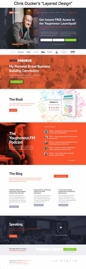 A great way to do this is to use a “Layered Design”. This is where you have a long, scrolling home page with visually demarcated sections, each dedicated to one specific priority. Your number one priority appears front and centre on the home page as the top layer with just enough of the next layer showing that people know they can scroll down if what you're offering first isn't for them. Layer two is your second priority, layer three is your third etc.
Structuring your website like this means that your number one priority goal/call to action gets the most attention. But people looking for something else can find the right call to action for them just by scrolling.
Chris Ducker's website is a great example of this technique in action.
If you look at the screenshot over on the right you can see the multiple layers. The top section is his #1 priority: getting you to sign up for his Youpreneur Launchpad.His #2 priority is to promote his membership community. #3 is his book, #4 is his podcast, then comes his blog and then his speaking services.
Structuring his site like this means people keen to find out about his speaking services or podcast can do so with a quick scroll. But everyone's attention is initially pointed towards what he most wants you to do: sign up for his lead magnet and regular emails.
Mistake #3: No Valuable Content
I'm sure you've seen a boatload of “brochure” websites with little more than a home page, a services page, about me and a contact page.
You can succeed with this sort of site. If you're just starting out it'll be tough enough for you to get a decent brochure site up and running quickly let alone fill it with brilliant content.
But over time, if you want to establish yourself as an authority in your field, or simply build credibility for when potential clients check you out, then you will need valuable content on your site.
And note, I said valuable content, not just content.
As I said in No One Needs Your Crappy Content far to much of what passes for content on professional service websites is simply common knowledge regurgitated. You don't become seen as an expert just by writing blog posts or doing videos or podcasts or webinars.
 You become seen as an expert because the content you share is new, original, insightful and useful.
Far too many people are teaching others to become seen as experts in their field by telling them to write blog posts, do videos, podcasts and tons of other content without focusing on the quality and value of the content produced.
There are hundreds of thousands of business books written every year, but very few of their authors are every recognised as experts. There are literally millions of blog posts, podcasts and videos being made with even fewer of their creators ever making more than a tiny impression on their audiences.
Go for quality over quantity. Make sure you have valuable content, not just content.
It's the value your potential clients get from your content that will give them the confidence to hire you, not the amount of it you produce.
Mistake #4: No Personality
This is especially important if you're a small business or solo professional where you are your differentiation. It's also true for larger firms (but much harder to do – that's why it's so important for small firms to get it right, it's one of your few chances to stand out against bigger competitors).
In a service business, your clients aren't hiring faceless minions to work with them, they're hiring talented people. And they know, even if only subconsciously, that if their work with you is going to be a success then they'll need to “click” with you.
Yet so many people make it almost impossible for potential clients to judge this from their website. They remove all traces of personality and try to make their bright solo business look like a dreary beige corporate.
Often they don't even have a picture of them or any details of who they are despite the fact that one of the biggest hiring criteria clients will use is whether they feel they'll get along with you.
Now, I know this can be daunting and you worry that you might put people off by being open about who you are. But they're going to find out anyway. Better to put them off through your website than waste time meeting them just to find out you're not a great fit.
And I know we're taught to be client focused, not “me” focused. But on most websites the second or third most visited page after the home page is your “About Me” page. Clients aren't visiting that just to read about your corporate vision or that you've worked with dozens of blue chip organisations. They want to get a sense of the people they'll be working with.
Of course, you should talk about yourself in terms of things your potential clients would be interested in. If you tell them about your background, make sure it's something they can empathise with and tells them you've been through the things they're going through and will understand them. Mention the result you've got for yourself and the clients you've worked with to build your credibility. But include personal things too.
 Show them you're human. try a bit of humour. Many people contacting me mention my favourite football team as an icebreaker to make that connection easier and more casual. And they can only do that because I mention it on my site.
Personally, I base my About Me page on a template I discussed with Derek Halpern many years ago.
Derek's “trick” for About Me pages is to start off talking about the site first and especially the value the visitor can get from it. That then leads to a call to action to sign up for regular updates, before moving on to the about me section itself. That makes the page more client focused, and progresses potential clients quickly into your marketing system.
And your personality isn't just about your About Me page. It's about the way you write your blog, the way you appear and sound in videos and podcasts. Whether you use the same stock images as everyone else on your site, or something a little bit different and more personal to you.
Mistake #5: It Doesn't Work on Mobile
The technical guys call this being “mobile responsive” (well, close enough).
A recent Adobe Digital Index Survey found that 92% of respondents consider their smartphone to be their primary device. And Forrester report that over 50% of searches now happen on mobile.
 Having said that, while most people spend more time on mobile devices than desktops/laptops, they're mainly using email, messaging and social media. When it comes to website visits, according to Adobe Analytics, about 60-70% are made on desktops in most sectors (this aligns with my own experience for my site).
The implication of that is that right now, desktop is still the most important device for your website to work well on.
But if 30-40% of your traffic is coming from mobile (especially if you get a lot of visits from social media) then you absolutely need your website to work well on mobile devices too – you can't ignore it. Especially since Google penalises sites that aren't mobile responsive in the search results from a mobile search.
 You can see how your site looks on mobile to Google using webmaster tools here. And there are a variety of mobile simulators like this one. But at the end of the day the only surefire way to know is to use your site on real mobile devices.
At minimum, your site should be viewable on mobile without everything appearing shrunk and unreadable. Most modern responsive website themes can just about handle that.
But you also need to think about things like popups (which are hugely painful when they appear on mobile and often don't display properly so can't be closed), buttons (which might need to be made bigger and more spaced apart), form fields (lots of typing on a mobile device is painful so consider removing form fields) and images (which might need to be removed altogether if they take up too much space).
Mistake #6: A Site That's Impossible to Read for Anyone over 40
 I don't know about you, but my eyesight's not what it was.
Actually, I probably do know about you. Starting at around age 40, most of us begin to struggle to focus close up due to a phenomenon known as Presbyobia: a natural hardening of our eye lenses and loss of flexibility in the muscle fibres around them.
Typically, websites are designed and developed by younger folks (using giant screens) who have no such problems. But your clients will usually be rather older, especially the more affluent ones and more senior staff members in client organisations. They'll struggle to read badly designed websites, especially on mobile devices.
Some keys to making your website easy to read:
- Use a large font size. Much larger than you'd think (and way larger than your teenage web designer would use). A 16px font size viewed on a screen at normal reading distance works out at approximately the same size as the text in a printed book or magazine. But most websites use 14px text or smaller.
- Keep each line of text ideally between 45-75 characters. The Baymard Institute showed that much shorter line lengths result in the eye travelling back to the start of the line too often, breaking the rhythm of reading. And longer line lengths result in the reader losing track and focus on which line they're reading.
- Use whitespace, bulleted lists, subheadings and images to break up large blocks of text. And ideally write in short sentences and short paragraphs. Not only is a large section of pure text more difficult to read, it also looks like it's more difficult to read and puts readers off.
- Make sure there's enough contrast between your background colour and your text colour. Blue on black is clearly a mistake, but even professional web designers frequently use difficult-to-read combinations like light grey on white. It turns out that since they know what's written on the page, they don't really read it when reviewing and don't realise how difficult it can be.
Mistake #7: A Sloooow Loading Website
Speed matters.
According to Amazon, every 1 second delay in loading a page decreases sales by 7%. And according to Google in their Site performance for Webmasters video, “2 seconds is the threshold for e-commerce website acceptability. At Google, we aim for under a half second.”
A slow site also has a small, but noticeable impact on your rankings in the search engine results.
 I have to admit, my site suffers from this right now. I'm currently trying out a variety of tracking and split testing tools and it's taking its toll on the load speed of my site. At the end of the testing though I'll be removing unnecessary scripts to speed up the site.
Optimising your site for speed can get quite technical. But some simple things you can do are:
- Compress images before using them on your site. Resize images to be the size you need them before uploading (rather than uploading a huge image and getting your site to resize it on the fly) and remember to switch on compression when saving an image from your graphics tool (or use online tools like tinypng.com or compressjpg.com.
- Remove unused or little-used plugins from your website – these take time to load even if you're not using them.
- Use a high performance web host – this can make a huge difference. Personally I recommend Lightningbase and use it for this site. It has super high performance at a price way lower than many big name hosts that don't perform anywhere near as well. I switched over to Lightningbase after reading Review Signal's in-depth performance testing of WordPress hosts a few years ago. Here's their latest analysis and recommendations (scroll down for the non-geeky recommendations).
- Use caching tools like the W3 Total Cache Plugin for WordPress and Cloudflare.
You can use tools like Pingdom to get an analysis of your site's performance and recommendations on how to improve it.
Mistake #8: No Easy Way of Contacting You
 This is an extension of missing calls to action from Mistake #1, but very specifically it relates to how easy it is for your web visitors to get in touch with you.
How many websites have you seen where the phone number of the business is hidden away on an obscure corner of a little-used page?
That's fine if, like me, you run an online business and don't actually get clients from conversations with people. But for a professional service business, clients will want to speak to someone before they hire you. And usually that will mean a phone call. So get that phone number at the top of every page! Don't make your potential clients hunt round to find it. At best you'll annoy them. At worst, they'll give up and go to someone else's site.
And make sure you give people clear instructions on what will happen if they contact you. Far too many website contact forms are “bare bones”. Just a Contact Us title and a form.
What will happen next? Will someone call me? Who will it be? How long will it take? What kind of questions can I ask?
If you're in a rush and a contact form gives no indication of the turnaround time for contact requests then you just won't bother – even if the business could easily have responded in time. If you're worried about being called by salespeople then you'll steer clear of forms that ask for your details but don't reassure you that there'll be no sales call. And if it's not quite clear what sort of questions you can ask via the form you might well think that a technical question or feedback or anything out of the ordinary won't be responded to. So you won't bother asking.
Another option for your site is to use a chat box for people to contact you, especially on your sales, services or products pages because that's where they're most likely to have questions.
Mistake #9: Not Using Dedicated Landing Pages
All the mistakes we’ve talked about so far relate to your home page and the main pages on your website that visitors might get to through the normal navigation or perhaps from a google search or link on social media.
In these situations, you don’t really have control over which page your visitors go to. But often you do have control and can send visitors exactly where you want them to go. For example in links from paid advertising on Google or Facebook, in links from external content you produce (like guest blog posts, your social media profiles and content, links from youtube videos etc.).
A huge mistake many people make is to waste this level of control. They send visitors from their bio in guest blog posts to their home page rather than a dedicated “landing page” created specifically to welcome those visitors and convert them into email subscribers.
Or worse, they pay for traffic from Google Adwords or Facebook Ads and then send those visitors to their home page: the most generic page on their site.
Your home page and standard website pages need to cater for lots of different types of visitors. A landing page doesn’t: it can be laser targeted on exactly the type of visitor you’re sending to it and engineered to maximise the chances of them taking the action you want.
 As an example, the typical email sign up rate on a blog post is about 1-3%. if you have a great home page focused on getting email signups then you might get a 10% optin rate there. But right now my main dedicated landing page that I send Facebook ad traffic to has an optin rate of 58%, and the page I send traffic from referrals from partners to has a 77% optin rate.
That’s a huge difference.
Of course, part of the reason it’s higher is that the traffic is high quality and pre-qualified to want to sign up. But a lot of the reason is that the landing page has been carefully designed to motivate people to sign up.
It has a strong headline and clear call to action. There’s social proof and testimonials. There are no prominent menus, distractions or other links away from the page. And the button to sign up is highly visible.
You can build Landing Pages like this using tools like Thrive Landing Pages and Leadpages. Leadpages tends to be more template driven, faster to get pages up and running, but more expensive and less flexible. Thrive Landing Pages is dirt cheap, very flexible, but with fewer built in templates to choose from.
Whichever route you go down, make sure you’re using dedicated landing pages.
Which of These 9 Mistakes Are You Making on Your Site?
More importantly, what are you going to do about it?
Here’s a quick action plan to eradicate the worst of these mistakes from your site and get a lot more leads and clients as a result:
- Review the main pages on your site using the “9 mistakes checklist” you can download below.
Make sure you review your home page, about me page, contact me page, services page, and your main (most visited) blog posts. Check your landing pages against the key points in mistake #9. - Where you spot a mistake note down what the mistake is and what the recommended solution is. When your review is complete, look at your notes and highlight the mistakes that seem to have the biggest impact – e.g. it’s an area of the site that gets a lot of visitors and you’re a long way from the recommended practice.
- Prioritise the areas to focus on first: those with the biggest impact that wouldn’t require huge changes to your site to fix.
- Set target dates to get these top issue fixed. Address them one at a time.
- Get going!
Want a Copy of This Article in PDF Format Along With My Web Design Mistakes Checklist?
For easy reference I've put this article into a PDF you can download, along with a checklist you can use to review your web site to identify improvements you need to make. You can download a free copy below:

** The links to Thrive Leads/Landing Pages on this post are affiliate links. That means I get paid a commission if anyone buys through these links. Obviously though, these are tools I use myself personally and thoroughly recommend. **

Ian Brodie
https://www.ianbrodie.comIan Brodie is the best-selling author of Email Persuasion and the creator of Unsnooze Your Inbox - *the* guide to crafting engaging emails and newsletters that captivate your audience, build authority and generate more sales.